Responsive
websites to adapt to any screen, regardless of size, definition or orientation
Responsive Web Design / Mobile Apps / Ecommerce / SEO / Hosting / Web Design / Social Media / e-Learning / WordPress
If you've looked into website design recently, you've likely come across something called responsive web design (RWD). This type of design has become more and more popular in recent years, and will continue to be a go-to style. To help show you why you should be using responsive design for your business website, here are five key principles of RWD.
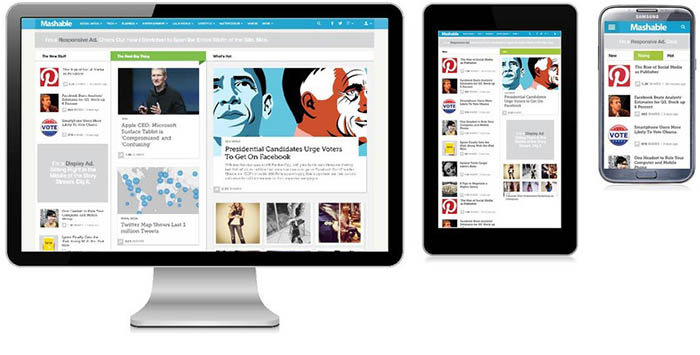
1. What is responsive design?
RWD allows websites to adapt to any screen, regardless of size, definition or orientation. This means that a responsive website will look just as good on a 1024 X 768 desktop screen as it will on a seven-inch tablet held in portrait mode or a four-inch smartphone held sideways in a landscape mode. It "responds" to whatever device is being used to view the site.
2. How does responsive design work?
In RWD, every element of a page's layout is fluid, meaning each element is flexible to adjust its size to fit whatever screen it is on. Even the structural elements of the page itself (known as layout columns) are flexible and adjust as needed depending on the size and orientation of the page. It has been possible to make text and structural elements fluid for a few years now, mainly due to the range of computer monitors available. But the flexibility of these items were limited (size often could only vary by a maximum of a few hundred pixels), and many other elements, particularly images, weren't fluid at all. Today, nearly every aspect of a website's design can be made adaptable to the screen being used.
3. The rise of mobile causes a design shift
Nearly 130 million Americans owned smartphones, representing a 55 percent mobile market penetration. Tablets are expected to outsell laptops for the first time this year. With numbers this high in the U.S. alone, it is easy to see way responsive design is so important. You need your business site to be optimized for viewing on laptops, desktops, tablets and smartphones, otherwise you risk alienating a huge potential customer base.
4. A mobile site for every OS not practical
With the rise of mobile, many developers began creating different sites for each different device. This meant in addition to a desktop site, businesses would also need a separate mobile site for iOS, Android, Blackberry and any other mobile platforms that is introduced. Responsive web design eliminates the need (and cost) of all these individual sites. Instead, customers can reach one site that is attractive and useful across all devices.
5. RWD makes it easy on your customers
That last point highlights the most important aspect of responsive website design: the ease of access it provides your customers. This may seem obvious, but making your business site easy to use prevents your customers from getting frustrated by difficult to view and navigate websites. A frustrated customer isn't going to hang around on your site, he's going to go to a competitor who makes it easier for him to order the product or service he wants. The number of mobile devices, as well as screen sizes and operating systems, will continue to grow. Responsive web design makes it possible for you to bring your website to all current and future devices without the need to have separate code for each.
Bgraphic is a 100% veteran, woman-owned and operated company based in Dallas, Texas.